New in VS Code: Inline Change Review
Expandable Git annotations in the gutter like in WebStorm 🎉
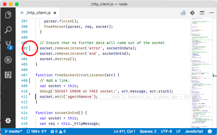
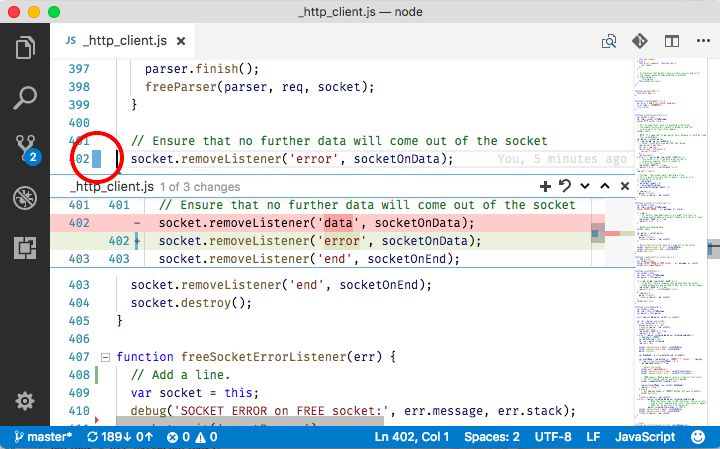
Since VS Code 1.18, you can expand the little Git annotations in the gutter like in WebStorm. They show the diff inline in the editor and make individual reverts easy.
The Git annotations in the gutter are subtle yet helpful. They instantly draw my eyes to the lines that I changed. Together with the inline view of the diff and the revert button, they are invaluable to me.
I need the inline change review when I delete too many lines or type in the wrong window. I need it when I make multiple changes and realize one of them doesn’t work. I need it when I refactor and want to compare to the previous version. I’m so happy this feature is in VS Code now 💚. I could do all of this on the command line, but inline is clearer because I don’t have to adjust to a different view or sort through all the other changes.

A blue bar in the gutter indicates that the line was changed. For new lines, the bar is green. A little red triangle symbolizes deleted lines.

Click on a gutter annotation to see the changes. I often find this more convenient than looking at the diff in other views. There is a revert button next to every change. In many cases, clicking the button is much quicker than using git checkout --patch (tough git commit -p is one of my favorite tools).
If you are switching over from WebStorm to VS Code, Asim Hussain has a video with great tips for converts.
